Monday, July 30, 2012

3 Presentations That Show Why The English Language Is Crazy

As an avid reader, writer, and teacher, I love words. I love exploring them with my students, finding just the right word for their own writing, and looking at the strangeness that is our language. Here are three "presentations" I found that can make a word-lover slip into a deep, dark crazy.


1) The first two presentations seem to taken from the same source. However I discovered them separately and I think they're more readable seperately, so they have become two different presentations. A more complete version can be found here. In any event, here is the first part:

1) The bandage was wound around the wound. 
2) The farm was used to produce produce . 
3) The dump was so full that it had to refuse more refuse.
4) We must polish the Polish furniture. 
5) He could lead if he would get the lead out.
6) The soldier decided to desert his dessert in the desert.
7) Since there is no time like the present, he thought it was time to present the present . 
8) A bass was painted on the head of the bass drum.
9) When shot at, the dove dove into the bushes.
10) I did not object to the object. 
11) The insurance was invalid for the invalid. 
12) There was a row among the oarsmen about how to row .
13) They were too close to the door to close it. 
14) The buck does funny things when the does are present.
15) A seamstress and a sewer fell down into a sewer line.


2) I posted this a couple months ago in my "A Look Back At School Through The Eyes of 9gag" post. It seems to be an extension of the first presentation, but here is the second piece:


3) This last presentation is half poem, half torture. I found it originally here.
Dearest creature in creation,
Study English pronunciation.
I will teach you in my verse
Sounds like corpse, corps, horse, and worse.
I will keep you, Suzy, busy,
Make your head with heat grow dizzy.
Tear in eye, your dress will tear.
So shall I! Oh hear my prayer.
Just compare heart, beard, and heard,
Dies and diet, lord and word,
Sword and sward, retain and Britain.
(Mind the latter, how it’s written.)
Now I surely will not plague you
With such words as plaque and ague.
But be careful how you speak:
Say break and steak, but bleak and streak;
Cloven, oven, how and low,
Script, receipt, show, poem, and toe.
Hear me say, devoid of trickery,
Daughter, laughter, and Terpsichore,
Typhoid, measles, topsails, aisles,
Exiles, similes, and reviles;
Scholar, vicar, and cigar,
Solar, mica, war and far;
One, anemone, Balmoral,
Kitchen, lichen, laundry, laurel;
Gertrude, German, wind and mind,
Scene, Melpomene, mankind.
Billet does not rhyme with ballet,
Bouquet, wallet, mallet, chalet.
Blood and flood are not like food,
Nor is mould like should and would.
Viscous, viscount, load and broad,
Toward, to forward, to reward.
And your pronunciation’s OK
When you correctly say croquet,
Rounded, wounded, grieve and sieve,
Friend and fiend, alive and live.
Ivy, privy, famous; clamour
And enamour rhyme with hammer.
River, rival, tomb, bomb, comb,
Doll and roll and some and home.
Stranger does not rhyme with anger,
Neither does devour with clangour.
Souls but foul, haunt but aunt,
Font, front, wont, want, grand, and grant,
Shoes, goes, does. Now first say finger,
And then singer, ginger, linger,
Real, zeal, mauve, gauze, gouge and gauge,
Marriage, foliage, mirage, and age.
Query does not rhyme with very,
Nor does fury sound like bury.
Dost, lost, post and doth, cloth, loth.
Job, nob, bosom, transom, oath.
Though the differences seem little,
We say actual but victual.
Refer does not rhyme with deafer.
Fe0ffer does, and zephyr, heifer.
Mint, pint, senate and sedate;
Dull, bull, and George ate late.
Scenic, Arabic, Pacific,
Science, conscience, scientific.
Liberty, library, heave and heaven,
Rachel, ache, moustache, eleven.
We say hallowed, but allowed,
People, leopard, towed, but vowed.
Mark the differences, moreover,
Between mover, cover, clover;
Leeches, breeches, wise, precise,
Chalice, but police and lice;
Camel, constable, unstable,
Principle, disciple, label.
Petal, panel, and canal,
Wait, surprise, plait, promise, pal.
Worm and storm, chaise, chaos, chair,
Senator, spectator, mayor.
Tour, but our and succour, four.
Gas, alas, and Arkansas.
Sea, idea, Korea, area,
Psalm, Maria, but malaria.
Youth, south, southern, cleanse and clean.
Doctrine, turpentine, marine.
Compare alien with Italian,
Dandelion and battalion.
Sally with ally, yea, ye,
Eye, I, ay, aye, whey, and key.
Say aver, but ever, fever,
Neither, leisure, skein, deceiver.
Heron, granary, canary.
Crevice and device and aerie.
Face, but preface, not efface.
Phlegm, phlegmatic, ass, glass, bass.
Large, but target, gin, give, verging,
Ought, out, joust and scour, scourging.
Ear, but earn and wear and tear
Do not rhyme with here but ere.
Seven is right, but so is even,
Hyphen, roughen, nephew Stephen,
Monkey, donkey, Turk and jerk,
Ask, grasp, wasp, and cork and work.
Pronunciation (think of Psyche!)
Is a paling stout and spikey?
Won’t it make you lose your wits,
Writing groats and saying grits?
It’s a dark abyss or tunnel:
Strewn with stones, stowed, solace, gunwale,
Islington and Isle of Wight,
Housewife, verdict and indict.
Finally, which rhymes with enough,
Though, through, plough, or dough, or cough?
Hiccough has the sound of cup.
My advice is to give up!!!
-The Chaos, by G. Nolst Trenite, aka Charivarius (1870-1946)

Thursday, July 26, 2012

Revisiting & Reviewing 5 Bookmarking Services

About two months ago I wrote about my frustrations with an old toy (Symbaloo), my excitement with my new toy (Clipboard), and a toy that hadn't been released yet (EduClipper). Now that EduClipper is in Beta and open to anyone who asks for invitations, I thought I revisit my earlier post on bookmarking services. I'll briefly compare the following:

Pinterest

EduClipper

Clipboard

Symbaloo

Pearltrees

What I believe would be the best service would be a service that develops an easy way to capture any part of a web page (header, video, image, description, etc.) that you want to be bookmarked in a clipboard area that looks like the "Cover Flow" view in iTunes, or the "New Tab" view in Chrome. None of these applications come close to that vision however.


Pinterest: I was really excited when I learned about Pinterest. The first thing I did was request an account. The second thing I did was create a "Web 2.0" board. It was so easy! Just click the red button labeled "Create Board", name the board, and voila! I was even more excited. Then I tried to "pin" one of my favorite web 2.0 apps, Prezi, at www.prezi.com. This is what I got:
Awesome! And Worthless!

I tried a few other web 2.0 apps that I liked. I either got the same message, or an image that I detested. And then I forgot about Pinterest until this started being publicized this summer:

EduClipper: EduClipper is a lot like Pinterest. In fact, it might be the exact same product rebranded under a different name. Wait, there's an introductory video to set the record straight and to clarify the differences: 


So I just want to analyze the raison d'être of Educlipper from this video for a moment by asking some rhetorical questions:

1) "Social Networks are great, but not everyone we need to share with is connected."
Really? And eduClipper bridges that gap?

2) "It's school friendly, and student safe"
What on earth does this mean? And on the flip side, if eduClipper is not simply rebranding Pinterest, then does that mean that Pinterest is school unfriendly and dangerous to students?

3) "You can 'clip' anything you want... absolutely anything!"
Great! Let's try the same thing I tried with Pinterest! 
1) First I created a 'clipboard' called "web 2.0". 
2) Next I installed the 'eduClip IT' button in my bookmarks bar on my Chrome browser.
3) I then went to www.prezi.com, and clicked the eduClip IT button, to choose my capture options. Here is what eduClipper gave me as bookmark options:
Just to be clear, the only option that is available is the eduClipper logo. 

Edit: The founder of EduClipper was kind enough to send me a very nice message (which is posted below), pointing out that:
a) At least one other person besides myself read this post, and
b) I was perhaps being too harsh for this new product. I agree. So let me just end this short review of EduClipper saying that it's not a good enough app for me to use consistently right now, but I look forward to trying out future iterations of the tool. 


Clipboard

I like Clipboard. It can bookmark the prezi homepage, which is plus, or any prezi project I created. It's kind of a slick interface too. After you install the Clipboard Clipper-Thingy on your browser, when you find a page or part of a page you want to save, just click the button. Then, "Hover over the part of the page you want to clip, and click to save it to your home page on clipboard.com." As you move the mouse, different parts of the page will turn glassy blue, signifying which area you can make a bookmark.
But it's not perfect.
The hovering thing gets kind of annoying when I can't get the blue glassy rectangle to cover exactly what I want it to cover. I would much prefer to actually have a clipping tool where I could define the clip area myself (like in any photo editing software) instead of the clipper just trying to guess what I want. 


I wrote a lot about Symbaloo here. The more I play around with other bookmarking tools, the less I like it. It takes too much time to create buttons, and they're not that visually appealing.


During the summer, it occurred to me that I like Pearltrees the best. The pearls are about the same size as Symbaloo buttons and you really can't tell a whole lot from looking at them, but it is by far the easiest process of the five to bookmark a page. Once the pearltree button is installed in your browser header, anytime you want to bookmark a page simply click on the button. If you have several pearltrees already built, a drop down menu will appear, and you just select the pearltree you want the page to be bookmarked in. Very simple, and no typing.

Here's a Pearltree I'm building as a resource to teach digital citizenship in the classroom:
Digital Citizenship and Common Sense in (salamanca)


Wednesday, July 25, 2012

Managing A Classroom Library Online

It struck me yesterday that it would help me out a lot if I had an online inventory of my classroom library. I'd have a record of what I had, and if I could find an online check-out system, and maybe it could even let the parents know at all times what their children had checked out. So I started looking at apps that would specialize in this, starting with the app that I knew best.

It would make sense that Shelfari had a way to show that a book has been borrowed or loaned. And in fact there is a way to do this, and it's amazingly awful. Here are the steps:


1) Move the mouse cursor over a book in your shelfari shelf and click the green edit button.
2) Click on the "My Edition" tab once the edit window pops up.
3) Fill out the "loaned to", "loan date", and "due date" information in the window.
4a) If you want your children to check out books then to find out what they've checked out, simply follow steps 1 and 2 for every book in your Shelfari shelf.
4b) If you've decided to check-out the books for the children on a daily basis and don't have a photographic memory, follow steps 1 and 2 for every book in your Shelfari shelf.

With Friends Like These...

In other words, there doesn't seem to be a way to track who's check out what without going to the "My Edition" tab in the edit box for each book. It's a completely useless feature.

Next, my Google Search led me to...


Delicious Library 2 looks like Shelfari, and is made exclusively for the mac. It uses the built in webcam to scan bar codes, and the titles instantly pop up. This was better than Shelfari because you don't have to type anything.

But there are a few problems. First there is no mobile app for Delicious Library 2, and it doesn't look like there will be one any time soon.

Second, since Delicious Library 2 is not an online application, any online presence needs to be exported. Here are your choices: MobileMe, or an FTP site. That's it. This along with no mobile support is a killer for me.
It is easy to show checked-out books though:
Do you see that faded book in the left corner? That's a book that's been checked-out. I simply drag and dropped the book into my friends list on the left. The problem with this is you don't know when it was checked out. Only that it is checked out. So I was off to find another app.

Since Delicious Library 2 didn't have any mobile app version of itself, I decided to check the iPad app store. I found these:

Book Crawler isn't bad. But I am frustrated with the "list" view of the books that are inventoried. As with all three of these iPad apps, Book Crawler allows you to scan bar codes of books to enter them into the database. Book Crawler does have a "cover flow" view, but it is so tiny, and so difficult to navigate that it makes it worthless. The edit box of each book has a field called "loan" where you can type any name into, and then you can sort books by that field, but that's not very helpful to me.
iBookshelf was the next iPad app that I tried. It was essentially the same, but I couldn't find any way to show that a book had been borrowed. Next...
Book Keeper looks a lot like Delicious Library 2 and Shelfari, except that the graphics for its book covers use the lowest resolution humanly possible. There's an example below, but once again I didn't like how limiting it was to check-out a book. There is a "loan to..." field in the edit box, and that's it. 

Here's how the cover should look of When Charlie McButton Lost Power:

And here is what it looks like in Book Keeper:

I gave up on iPad apps and went searching online again. I finally ran across this free service:
Classroom Organizer is entirely online, and there is a mobile app for it as well. The mobile app's function is to use the iPhone or iPad camera to scan books into the online database. It's incredibly convenient. Each student can also be entered into the database, and there are loads of check-out parameters that you can control, such as how long a book is allowed to be checked out, its condition, or if an overdue notice should be emailed to the teacher automatically. Reports can be easily generated in a variety of formats as well.
It's not a perfect app. It doesn't recognize some books that it should, and I can't import cover art if it doesn't recognize a book. But it's very good, and what I'll be using this year.

Tuesday, July 24, 2012

Choosing An Online Class Hub: Exploring Edmodo

This is part five in a five-part series on choosing a class internet hub. My objectives for an online class presence are:

1) Parents should see the class website as an intuitive and easy place to find, retrieve, and review information on class events and learning.
2) Students should want to come to the virtual space to explore on their own.
3) Parents should want to come to the virtual space to explore on their own.
4) The online space should be extension of the classroom where we can come together to discuss ideas, offer and seek help, and expand our understanding.


The last post dealt with the website I chose for my online class hub. Weebly, my website builder, handles the first three objectives pretty well. My last objective will be handled by:
I like Edmodo. A lot. I like that it's free, I like that it looks like Facebook, I like that a community of people can interact in groups that you, the teacher, can define, I like that students and parents can go to the "library" to download resources, and I like how it has a calendar integrated with each group that is created. Like I said, I like it a lot.
I don't like it as much as these guys, though. They have a series worth reading comparing edmodo to Schoology, Edu 2.0, and Schoolbinder.

Exploring Edmodo
Edmodo allows you to create different "walls" or "groups" or "rooms" or whatever you want to call them. They're essentially separate online spaces for different conversations. In middle school it would be helpful to have a different "room" for each subject, since each subject is taught by a different teacher. In elementary that's not necessary. Here are the "rooms" I decided on:
A Homework Room to collaborate on homework.
A Reflection Room where we can reflect about some of the projects, events, hopes, goals, and dreams that we have.
A forum where I'll post a question once a week and have the children answer. Sometimes the question will be a poll, sometimes it will be to analyze symbolism in music lyrics. 
The Ape Room, which I hope to be an off-topic discussion area. Last year I had several students share sites and photos they found via their email accounts. My hope is that this will be a more organized and convenient place to share.
In This Case, It's Not A Bad Thing

Edmodo allows not only students but parents to join in on the discussion. Because the look is so close to Facebook, I'm hoping that it will be more inviting than other discussion forums.

Awkward Edmodo
Edmodo allows teachers to create quizzes online and award "badges" to students. Badges are whatever the teacher defines. For example, a teacher can create and award a badge for reading 200 minutes in a week. I've watched a lot of Edmodo teacher videos. Often at some point in the video the teacher will exclaim something to this extent: "Edmodo has completely changed how I teach. Now I can prepare my students properly necessary critical thinking skills in the 21st century, because with Edmodo I can give students badges for doing something good, and quizzes for testing their knowledge." Yep. Badges and quizzes. The two features that get some teachers very excited about using Edmodo are two features that have been around for about forever. Those features aren't changing instruction. They're simply a slightly different way to present some very old ideas. We can "collect, collaborate, create" better than that. The quizzes feature might be a nice parlor trick, but the badges feature is just a rewards system. And that is unnecessary if what you're teaching is 
a) useful
b) pertinent, and
c) interesting.
If what you're teaching (or the app your using to teach it) is not these things, then why use it? In other words, please forget about the badges.
Badges Allow 21st Century Teachers To Be Transported Back In Time

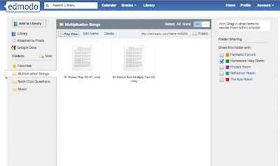
Edmodo looks cool, but it's not an online course management system, and can't be designed as such. It's not possible for me to create a highly organized and structured e-learning environment from Edmodo alone. Managing files is where Edmodo falls short, and why I decided to attach it to a website. Edmodo does have a "library" that allows you to upload and share files, and organize them into folders.
Upload And Share Files In Edmodo's "library"

But the design is slightly archaic. In fact, it reminds me too much of this: 
My First Computer

That's not necessarily a bad thing. I just feel there are just better ways to present and traverse through data now. That might be an unfair point, but I also needed a way to manage mixed media. For example, I have several Prezi presentations that look at different aspects of the curriculum I developed. Edmodo allows you to put embed code into its library, but it presents the code as an icon, which you have to click. Then you have to click a "view" button off to the right of the icon for the code to play. That's not very user friendly and doesn't really lend itself to exploration. And since that's the case, it goes against my second and third objectives.  But that's okay, because I think using my Weebly website and Edmodo together will make my online classroom hub pretty nifty. 

Monday, July 23, 2012

Choosing An Online Class Hub: The Beautiful Ones


This is part four of a (I'm sure now) five part series on choosing a class internet hub. My objectives for an online class presence are:

1) Parents should see the class website as an intuitive and easy place to find, retrieve, and review information on class events and learning.
2) Students should want to come to the virtual space to explore on their own.
3) Parents should want to come to the virtual space to explore on their own.
4) The online space should be extension of the classroom where we can come together to discuss ideas, offer and seek help, and expand our understanding.

For the past couple of posts I've raged against functional online sites and management systems that lend themselves to poor design and ugly interfaces.

To be clear, this is what I don't want my internet hub to look like:
Attack Of The Pixelated Clipart!

This time I'll briefly look at a couple of website creators that make beautiful pages. Although there are more, I'll be looking at Weebly and Wix. I originally wanted to comment on Yola and Zoho too. But I did not find them as impressive as either Weebly or Wix for various reasons, and this post was getting too big so I'll save those for another day.

I chose Weebly as the host for my class website this year. But it's not an all-in-one solution with me, so I'm using it in conjunction with Edmodo (which I'll talk about in my next post).


What I Like 
Weebly was featured as one of Time's 50 best websites in 2007, so it has been around at least that long. It's probably the easiest web site builder to use. It uses drag and drop widgets, so adding and rearranging content is easy. It also has a lot of templates, several of which are really appealing. I chose Weebly as my class website for this year, and stylistically, one of my favorite things is the flow of the drop down menus that let you navigate through the different pages. 
My Website in Weebly


Pages can either be web pages or blog pages, so I have the freedom of making, say, the homework page a blog page, which fits that content much better than a traditional web page. I've had no issues with adding or embedding content. It also seems faster than a lot of website builders, which is important in a country with limited bandwidth and slow connections.
It's not the most beautiful site builder, but the reason why I chose it as my class site is because I can have student accounts, each with their own website, with my free account. I used Posterous last year for student e-portfolios, but I'm trying to simplify things for the children this year, and since Posterous has been purchased by Twitter, I'm not sure what their plans are. Weebly allows me to have a class website, but also gives my 40 accounts for my students, so that everything is under a nice umbrella.
Just Like In Resident Evil


Weebly easily and gracefully handles my first, second, and third objectives. And since it's so simple to use, my other consideration was that I could teach other teachers who have never built a website how to use it, and they wouldn't give up in frustration. There's still a fourth objective to consider though. I'm using Edmodo to handle that one. Stay tuned.


What's Disappointing
Although Weebly is free, it might be tough to use it as e-portfolios for your students on a long term basis unless you upgrade. You get 40 free student accounts, which is great. But each account after that is $1.00. That's not that big of a deal, unless you want your kids to continue to have an e-portfolio as they continue their learning.  That's when it starts getting expensive quickly.
The free account only allows each student to create 5 pages total. That can quickly become a bottleneck.

Friday, July 20, 2012

Choosing An Online Class Hub: The Moodle Illusion

This is part three in (most likely) a four part series on choosing a class internet hub. My objectives for an online class presence are:

1) Parents should see the class website as an intuitive and easy place to find, retrieve, and review information on class events and learning.
2) Students should want to come to the virtual space to explore on their own.
3) Parents should want to come to the virtual space to explore on their own.
4) The online space should be extension of the classroom where we can come together to discuss ideas, offer and seek help, and expand our understanding.

I hope to use these objectives to guide my decision making, experimentation, and overall process of finding the right online hub for my class. This post focuses on course management systems. I could write about Schoology, or Edu 2.0, but since there are whispers of my school thinking about adapting Moodle, I'm going to direct my disapproving finger-wag towards its general direction.


The Moodle Illusion
I know Moodle is a powerful course management system. I know there are a lot of educators that swear by it. But Moodle has to be implemented in a system that supports that implementation, or else it's just a more complicated version of Google Sites. I know that is an obvious statement, but I see Moodle implemented in a lot of different schools that shouldn't touch the stuff. And the type of school that should stay away from Moodle is the school that doesn't understand or is unable to fully commit to these two beliefs:
1)  There needs to be a major commitment of training, planning, assessment, reflection, and ongoing development to run the system and adapt to the needs of the community.
2) There needs to be dedicated Moodle advocates on staff that have the technical expertise, time, and desire to make the first belief a reality.

Not for everyone, kid!


If there is an unawareness or unwillingness for a major time investment, then the school's Moodle system will be less successful than something much simpler, and look pathetic to boot. 


I work at a small international school There is pretty much one class for every grade. That changes a bit from year to year, but it holds mostly true. Two years ago there was a big purchase in SMART Boards,  with the thought being, I'm sure, "If you install them, they will be used." Or something like that. Yet after the installation, for at least a year they were barely touched. There just wasn't enough mindfulness about to what purpose do we, as a school, want them for, and through what type of training will we achieve those objectives. This isn't unique. The major mistake that schools repeat ad nauseum the world over is that the cost of a new product- in time, energy, and money- is finished once it is purchased and installed.
Training Is Not Only Overlooked In Schools

Moodle is an entirely different beast, and (in my admittedly limited experience) I haven't really seen a small international school implement it correctly, nor have I seen a classroom (with the possible exception of one) from a small international school create a space that follows my own objectives for an online class hub.

PHP Problem?
And remember those middle two objectives of mine? The ones that require great design to be integrated with great content? That seems to be rather challenging with Moodle's scripting language, PHP.  I don't know anything about PHP, but it seems rather tedious.

I do know that it is difficult programming something elegant with a language that is anything but. PHP may not be the best choice for a ginormous course management system, especially if your concerned with ease-of-use, adaptability, and good design. 

The Time Conundrum
How can schools who want to implement Moodle make the time necessary to train their faculty? Well, they have to make it a priority. This can be a problem, because you know what can't be a priority? Everything else. That means CIS accreditation, the curriculum review cycle, reviewing and assessing educational philosophy, policies, strategic plans, and strategic objectives, other in-house professional development, and the dozen or so other tasks all teachers and administrators do in their free time at a small school have to take a back seat.
Because You Can't Make An Omelet Without Breaking A Few Unicorns

And that is why it is so tough for a small school to do Moodle right. Because none of those things can take a back seat. They're all considered, rightfully so, a huge priority.


The Case Against Standardizing A Whole School Management System
If a small school like mine does adopt Moodle, and they're somehow willing and able to commit the time and resources to make it work, then that's good. For some.  I mentioned in my introductory post in this series that creating on online presence not only depends on personal objectives but the grade level you teach as well. As a fourth grade teacher, it shouldn't matter that my presence is standardized to match the other elementary grades, since we are all in self-contained classrooms. The picture looks a little different for middle and high school teachers since the children in those grades need an easy way to manage the course work from multiple teachers and expectations.
What I don't get is for a whole school to adapt the same same management system. That doesn't make sense to me, because as a fourth grade teacher I don't need a huge course management system. I'd rather identify what I need, and find the best tools to support that. That's what I like about web tools; there are always competing apps. I can try out several and find the best fit for my classroom. Maybe the best fit is my school's implementation of Moodle. But probably not. And ignoring individual teachers' passion, preferences, creativity, expertise, and objectives isn't such a super recipe. It stifles ideas and innovation, and that's not what we want a school to be- probably.

Wednesday, July 18, 2012

Choosing An Online Class Hub: Google Sites Makes Me Googity Sick


This is part two of a <cough, cough> part series on choosing a class internet hub. My objectives for an online class presence are:

1) Parents should see the class website as an intuitive and easy place to find, retrieve, and review information on class events and learning.
2) Students should want to come to the virtual space to explore on their own.
3) Parents should want to come to the virtual space to explore on their own.
4) The online space should be extension of the classroom where we can come together to discuss ideas, offer and seek help, and expand our understanding.

I hope to use these objectives to guide my decision making, experimentation, and overall process of finding the right online hub for my class. In my experience, the second and third objectives are extremely important, but are often overlooked. They're objectives that intertwine not only content, but design as well.
The guy on the right would agree with me

But they're tricky objectives too. As evidence, I submit school webpages from the district I student-taught in, my previous school, and my current school. These aren't meant to be bad examples. They just don't mindfully take into account the second and third objectives of what I think an online class (or in this case, school) hub should be. So with those objectives in mind...


Google Sites Makes Me Googity Sick
I wanted to like Google Sites when I was first introduced to it. I set up a page, and then, with my heart filled with... blood I guess, I looked forward to choosing a site style. Here is a sample of the wondrous array of choices that bewitched my senses:

Not to put too fine of a point on it, but there are even more style choices!


What better way to attract people to your website than using 8-bit color gradients and generic designs? Who wouldn't be transported to a luscious and magical field of green when choosing the "garden" style? Do you want to spice things up a bit, but still be alone? Then the "Solitude: Spice" style, with its insipid orange header and all white content area is just what the doctor ordered.

To be fair, you don't have to use one of the styles provided in Google Sites. If they have the time and the counter-intuitiveness it takes to be a Google Sites master, they can make a beautiful site like this one:
So I was okay with ignoring the styles and designing one of my own. But how these webpages look is only the beginning of the issues that I have with the application. 
The design of the published page is ugly, but the design of the web editor is clunky and restricting. Traversing from page to page can take an inexplicable amount of load time. Formatting a page can be weird and cumbersome. For example, sometimes I have issues with inserting a simple table, and sometimes I don't.  This sporadic issue with simple formatting is just the kind of excitement I look forward to when I'm updating a web page. But even saving work has caused problems for me. I used Google Sites as E-Portfolio pages for my class in 2010, and there were several times during our updates that Google Sites just refused to save changed content. The children had no choice but to do their work over again.

I'm probably missing something.  Google has lots of developers that should know better, so most definitely I am missing something and Google Sites may be a paradise of rainbows and unicorns. But I need to be proved wrong. The user interface for both the developer and the user are unacceptable for a classroom. Because Google Sites is ugly, difficult to work with, clunky, and counter-intuitive, it breaks my first, second and third objectives to having an online class hub to begin with. I'm not sure there is a worse free website host and editor.


Whether you agree or disagree with me, I would love to know your experience with Google Sites.
Related Posts Plugin for WordPress, Blogger...