This is part five in a five-part series on choosing a class internet hub. My objectives for an online class presence are:
1) Parents should see the class website as an intuitive and easy place to find, retrieve, and review information on class events and learning.
2) Students should want to come to the virtual space to explore on their own.
3) Parents should want to come to the virtual space to explore on their own.
4) The online space should be extension of the classroom where we can come together to discuss ideas, offer and seek help, and expand our understanding.
The last post dealt with the website I chose for my online class hub. Weebly, my website builder, handles the first three objectives pretty well. My last objective will be handled by:
The last post dealt with the website I chose for my online class hub. Weebly, my website builder, handles the first three objectives pretty well. My last objective will be handled by:
I like Edmodo. A lot. I like that it's free, I like that it looks like Facebook, I like that a community of people can interact in groups that you, the teacher, can define, I like that students and parents can go to the "library" to download resources, and I like how it has a calendar integrated with each group that is created. Like I said, I like it a lot.
I don't like it as much as these guys, though. They have a series worth reading comparing edmodo to Schoology, Edu 2.0, and Schoolbinder.
Exploring Edmodo
Edmodo allows you to create different "walls" or "groups" or "rooms" or whatever you want to call them. They're essentially separate online spaces for different conversations. In middle school it would be helpful to have a different "room" for each subject, since each subject is taught by a different teacher. In elementary that's not necessary. Here are the "rooms" I decided on:
A Homework Room to collaborate on homework.
A Reflection Room where we can reflect about some of the projects, events, hopes, goals, and dreams that we have.
A forum where I'll post a question once a week and have the children answer. Sometimes the question will be a poll, sometimes it will be to analyze symbolism in music lyrics.
The Ape Room, which I hope to be an off-topic discussion area. Last year I had several students share sites and photos they found via their email accounts. My hope is that this will be a more organized and convenient place to share.
In This Case, It's Not A Bad Thing
Edmodo allows not only students but parents to join in on the discussion. Because the look is so close to Facebook, I'm hoping that it will be more inviting than other discussion forums.
Awkward Edmodo
Edmodo allows teachers to create quizzes online and award "badges" to students. Badges are whatever the teacher defines. For example, a teacher can create and award a badge for reading 200 minutes in a week. I've watched a lot of Edmodo teacher videos. Often at some point in the video the teacher will exclaim something to this extent: "Edmodo has completely changed how I teach. Now I can prepare my students properly necessary critical thinking skills in the 21st century, because with Edmodo I can give students badges for doing something good, and quizzes for testing their knowledge." Yep. Badges and quizzes. The two features that get some teachers very excited about using Edmodo are two features that have been around for about forever. Those features aren't changing instruction. They're simply a slightly different way to present some very old ideas. We can "collect, collaborate, create" better than that. The quizzes feature might be a nice parlor trick, but the badges feature is just a rewards system. And that is unnecessary if what you're teaching is
a) useful
b) pertinent, and
c) interesting.
If what you're teaching (or the app your using to teach it) is not these things, then why use it? In other words, please forget about the badges.
Badges Allow 21st Century Teachers To Be Transported Back In Time
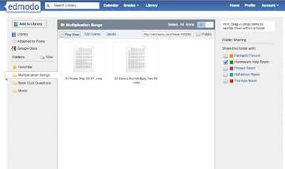
Edmodo looks cool, but it's not an online course management system, and can't be designed as such. It's not possible for me to create a highly organized and structured e-learning environment from Edmodo alone. Managing files is where Edmodo falls short, and why I decided to attach it to a website. Edmodo does have a "library" that allows you to upload and share files, and organize them into folders.
Upload And Share Files In Edmodo's "library"
But the design is slightly archaic. In fact, it reminds me too much of this:
My First Computer
That's not necessarily a bad thing. I just feel there are just better ways to present and traverse through data now. That might be an unfair point, but I also needed a way to manage mixed media. For example, I have several Prezi presentations that look at different aspects of the curriculum I developed. Edmodo allows you to put embed code into its library, but it presents the code as an icon, which you have to click. Then you have to click a "view" button off to the right of the icon for the code to play. That's not very user friendly and doesn't really lend itself to exploration. And since that's the case, it goes against my second and third objectives. But that's okay, because I think using my Weebly website and Edmodo together will make my online classroom hub pretty nifty.


No comments:
Post a Comment