This is part four of a (I'm sure now) five part series on choosing a class internet hub. My objectives for an online class presence are:
1) Parents should see the class website as an intuitive and easy place to find, retrieve, and review information on class events and learning.
2) Students should want to come to the virtual space to explore on their own.
3) Parents should want to come to the virtual space to explore on their own.
4) The online space should be extension of the classroom where we can come together to discuss ideas, offer and seek help, and expand our understanding.
For the past couple of posts I've raged against functional online sites and management systems that lend themselves to poor design and ugly interfaces.
To be clear, this is what I don't want my internet hub to look like:

Attack Of The Pixelated Clipart!
This time I'll briefly look at a couple of website creators that make beautiful pages. Although there are more, I'll be looking at Weebly and Wix. I originally wanted to comment on Yola and Zoho too. But I did not find them as impressive as either Weebly or Wix for various reasons, and this post was getting too big so I'll save those for another day.
I chose Weebly as the host for my class website this year. But it's not an all-in-one solution with me, so I'm using it in conjunction with Edmodo (which I'll talk about in my next post).

What I Like
Weebly was featured as one of Time's 50 best websites in 2007, so it has been around at least that long. It's probably the easiest web site builder to use. It uses drag and drop widgets, so adding and rearranging content is easy. It also has a lot of templates, several of which are really appealing. I chose Weebly as my class website for this year, and stylistically, one of my favorite things is the flow of the drop down menus that let you navigate through the different pages.

Pages can either be web pages or blog pages, so I have the freedom of making, say, the homework page a blog page, which fits that content much better than a traditional web page. I've had no issues with adding or embedding content. It also seems faster than a lot of website builders, which is important in a country with limited bandwidth and slow connections.
It's not the most beautiful site builder, but the reason why I chose it as my class site is because I can have student accounts, each with their own website, with my free account. I used Posterous last year for student e-portfolios, but I'm trying to simplify things for the children this year, and since Posterous has been purchased by Twitter, I'm not sure what their plans are. Weebly allows me to have a class website, but also gives my 40 accounts for my students, so that everything is under a nice umbrella.

Weebly easily and gracefully handles my first, second, and third objectives. And since it's so simple to use, my other consideration was that I could teach other teachers who have never built a website how to use it, and they wouldn't give up in frustration. There's still a fourth objective to consider though. I'm using Edmodo to handle that one. Stay tuned.
What's Disappointing
Although Weebly is free, it might be tough to use it as e-portfolios for your students on a long term basis unless you upgrade. You get 40 free student accounts, which is great. But each account after that is $1.00. That's not that big of a deal, unless you want your kids to continue to have an e-portfolio as they continue their learning. That's when it starts getting expensive quickly.
The free account only allows each student to create 5 pages total. That can quickly become a bottleneck.

What I Like

What's Disappointing
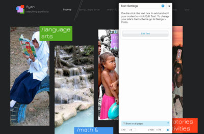
Wix has an annoying little habit that I haven't figured out how to turn off or make less distracting. Whenever I want to edit a widget- a text box, or image, or html box, or anything- an often pointless, giant gray rectangle pops up giving me options. Here all I want to do is edit the "/social studies" text box. I should be able to click on it and manipulate it directly. Instead, this happens:
Well that's it. I use wix as my e-portfolio because it has the best design, and I use weebly as my class website because it has most of the features I'm looking for, and is easy to teach if other teachers want to learn.
What I Like
Weebly was featured as one of Time's 50 best websites in 2007, so it has been around at least that long. It's probably the easiest web site builder to use. It uses drag and drop widgets, so adding and rearranging content is easy. It also has a lot of templates, several of which are really appealing. I chose Weebly as my class website for this year, and stylistically, one of my favorite things is the flow of the drop down menus that let you navigate through the different pages.
My Website in Weebly
Pages can either be web pages or blog pages, so I have the freedom of making, say, the homework page a blog page, which fits that content much better than a traditional web page. I've had no issues with adding or embedding content. It also seems faster than a lot of website builders, which is important in a country with limited bandwidth and slow connections.
It's not the most beautiful site builder, but the reason why I chose it as my class site is because I can have student accounts, each with their own website, with my free account. I used Posterous last year for student e-portfolios, but I'm trying to simplify things for the children this year, and since Posterous has been purchased by Twitter, I'm not sure what their plans are. Weebly allows me to have a class website, but also gives my 40 accounts for my students, so that everything is under a nice umbrella.

Just Like In Resident Evil
Weebly easily and gracefully handles my first, second, and third objectives. And since it's so simple to use, my other consideration was that I could teach other teachers who have never built a website how to use it, and they wouldn't give up in frustration. There's still a fourth objective to consider though. I'm using Edmodo to handle that one. Stay tuned.
What's Disappointing
Although Weebly is free, it might be tough to use it as e-portfolios for your students on a long term basis unless you upgrade. You get 40 free student accounts, which is great. But each account after that is $1.00. That's not that big of a deal, unless you want your kids to continue to have an e-portfolio as they continue their learning. That's when it starts getting expensive quickly.
The free account only allows each student to create 5 pages total. That can quickly become a bottleneck.
Wix is, in a word, gorgeous. Which is a bit surprising since their mascot is so terrible. They have the best website templates and they have a lot of variety. It's converted to HTML5 recently and so it works on iPads and has some really pretty effects. If I wanted to develop a stand alone class website, and wasn't thinking about student portfolios, this is where I would make it. In fact, I am using it for my own e-portfolio.
My Website in Wix
Wix has an annoying little habit that I haven't figured out how to turn off or make less distracting. Whenever I want to edit a widget- a text box, or image, or html box, or anything- an often pointless, giant gray rectangle pops up giving me options. Here all I want to do is edit the "/social studies" text box. I should be able to click on it and manipulate it directly. Instead, this happens:
Get Out Of My Way, Ye Box Of Gray!
The button in the giant gray box says "edit text." If I click on it, I can edit the text. I hate this level of bureaucracy. If wix wasn't so dang pretty, I wouldn't put up with it.
No comments:
Post a Comment